Typography plays a larger role in website effectiveness than many business owners realize. Beyond aesthetics, fonts influence readability, credibility, and how information is processed. Thoughtful Google Font Pairings can help a business website feel more polished, trustworthy, and intentional — without relying on trends or decorative elements that distract from the message.
Because Google Fonts are free, open source, and widely supported, they’re a practical choice for business websites. When paired well, they can elevate a site’s visual hierarchy and reinforce brand tone while remaining highly readable across devices.
Why Typography Matters on a Business Website
Fonts subtly shape how a website is perceived. Clean, legible typography supports clarity, while poor font choices can make even well-written content harder to engage with.
Typography decisions should consider:
- the target audience
- the tone of the brand
- readability across desktop and mobile
- visual hierarchy between headings and body text
A website aimed at professionals may benefit from classic, restrained fonts, while a more modern or creative business might lean toward cleaner, contemporary styles. These decisions are best evaluated alongside layout, spacing, and structure, often revealed through a website and SEO audit.
Google Font Pairings: A Practical Approach
When working with Google Fonts, simplicity and contrast are essential. Most business websites perform best using two fonts:
- one for headings
- one for body copy
Occasionally, a third font may be used sparingly for accents, but restraint keeps the site looking professional rather than cluttered.
When evaluating Google Font Pairings, web designers typically look for:
- contrast between heading and body fonts
- consistency across pages
- readability at different screen sizes
- alignment with the brand’s tone
How Web Designers Help With Font Selection
While many fonts may look appealing in isolation, not all combinations work well in practice. A font that looks great in a headline may feel overwhelming in navigation or body text, and a readable paragraph font may lack enough contrast for headings.
This is where professional web design support adds value. Rather than selecting fonts based on trends, designers evaluate how typography supports:
clarity and hierarchy
brand consistency
accessibility and readability
the overall user experience
The goal is to make font choices feel seamless so visitors focus on the message, not the design itself.
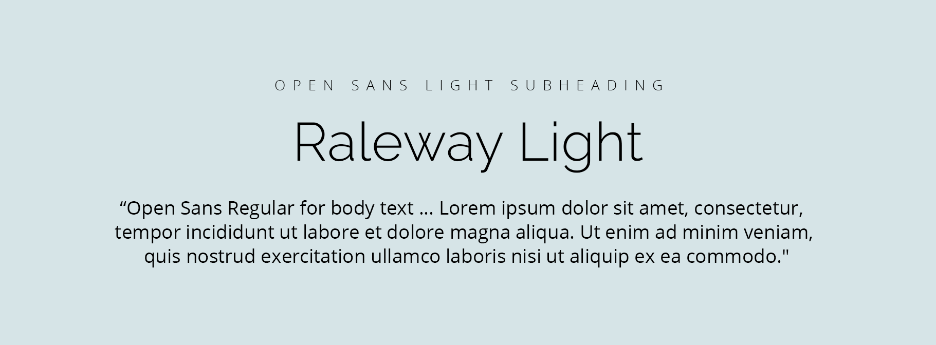
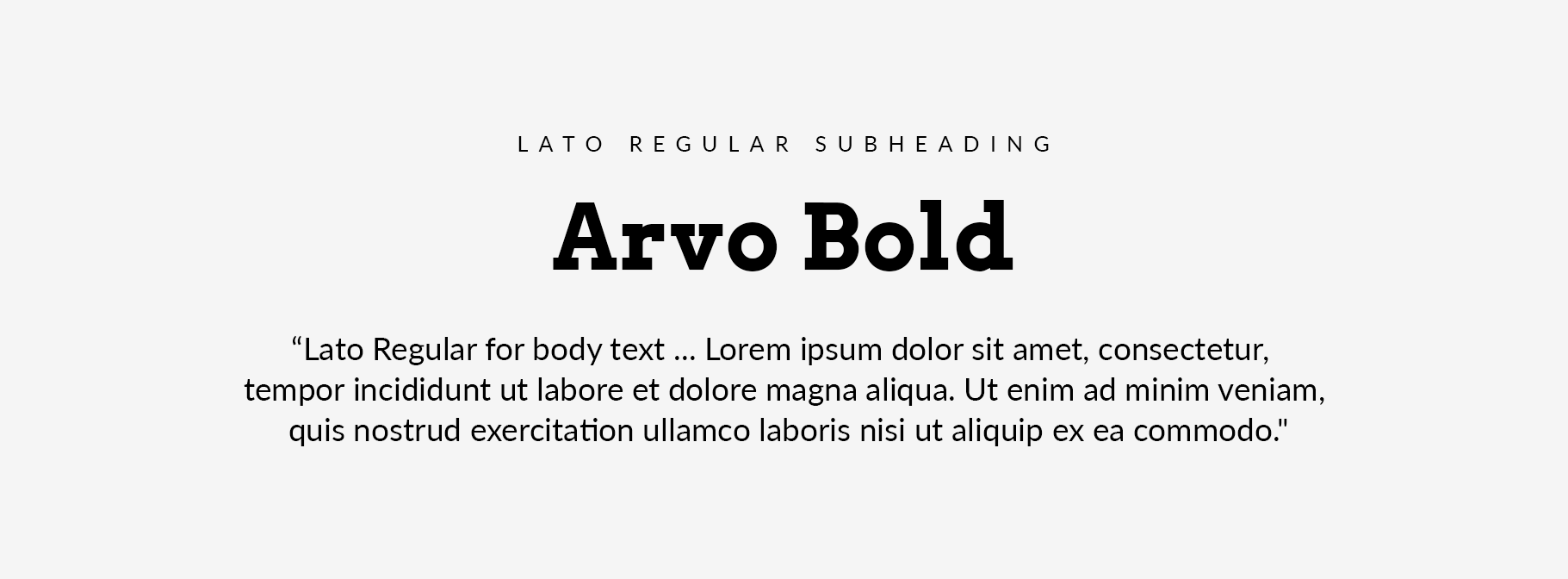
Google Font Pairings for Your Website
Below are several proven font combinations that work well for business websites. Each pairing balances readability with visual interest while maintaining a professional tone.
These combinations work particularly well when applied consistently across headings, body text, and navigation.
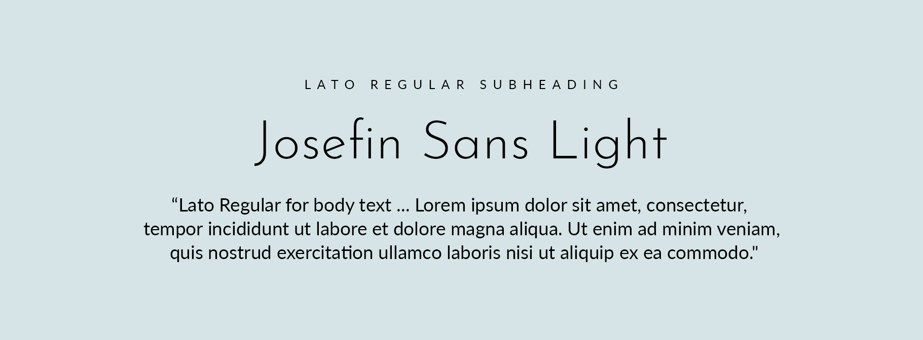
Lato and Josephin Sans
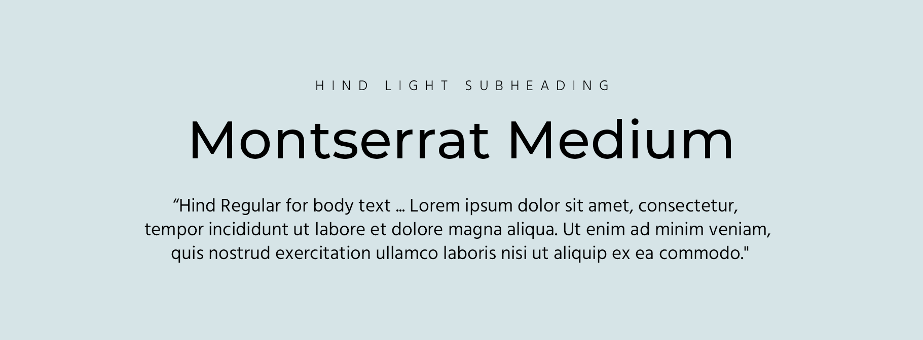
Hind and Montserrat
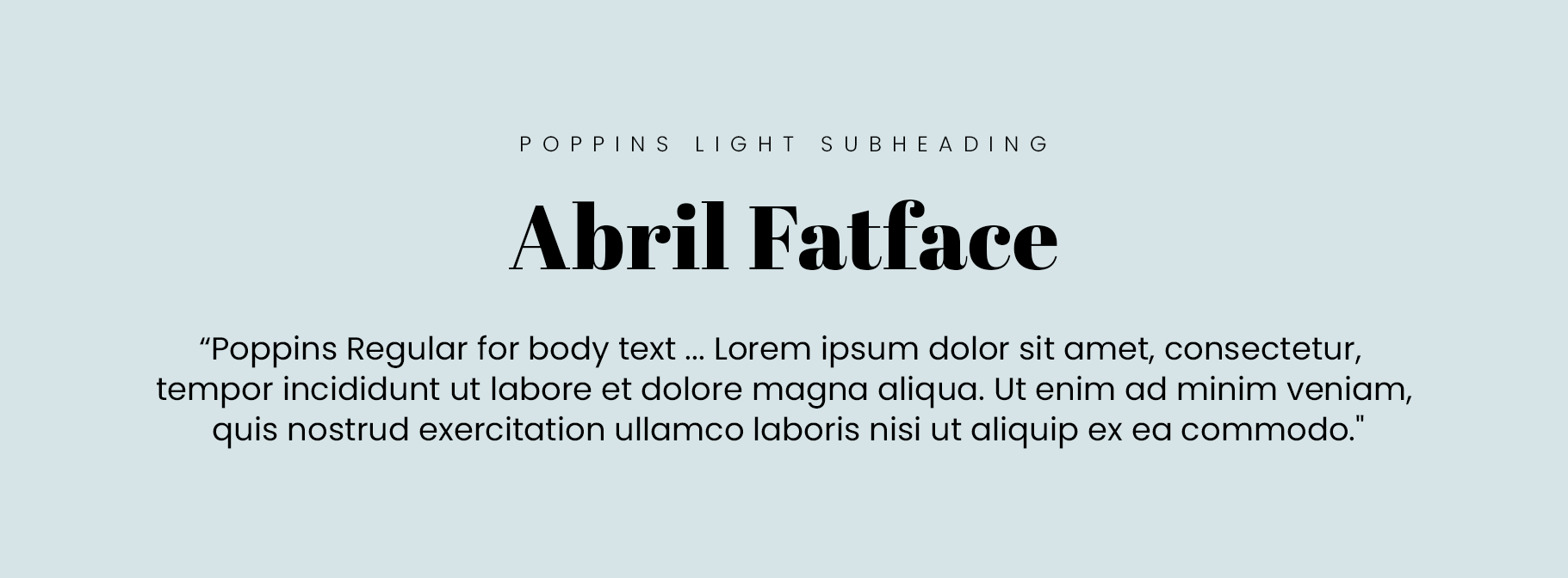
Poppins and Abril Fatface
Final Thoughts
Typography is one of the most overlooked elements of effective web design, yet it has a significant impact on how a website feels and functions. Clean, readable font choices support trust and make content easier to engage with.
While font pairing tools can provide inspiration, selecting the right typography is ultimately about how well it supports the business, the brand, and the visitor experience. When typography, layout, and structure are considered together, a website feels cohesive, intentional, and professional.